Open Data Day Interview: Mapping Data with Milos Popovic
 Interactive map taken milosp.info © Miloš Popović and Aleksandar Popović
Milos Popovic is a researcher, a data scientist, Marie Curie postdoc & Top 10 dataviz & R contributor on Twitter according to NodeXL. He took part in policy debates about terrorism and military intervention and appeared on a number of TV channels including N1 (the CNN affiliate in the Western Balkans), Serbian National Television and Al-Jazeera Balkans. My research interests are at the intersection of civil war dynamics and postwar politics in the Balkans. He is going to join the Data & Lyrics team on International Open Data Day to help us put harmonized environmental degradation perception and environmental sensory data on maps. We asked him four questions about his passion, mapping data. Please join us 6 March 2021 9.30 EST / 15.30 CET for an informal digital coffee.
As a researcher, why are you so much drawn into maps? Is this connected to your interest in territorial conflicts, or you have some other inspiration?
That’s a great question that really makes me pause and look back at the past 5 years. My mapping story started out of curiosity: I found interesting data on the post-WWII violence in Serbia and thought how cool it would be to make a map in R. I quickly made an unimpressive choropleth map and noticed some unexpected patterns. Then I realized just how much unused violence and census data sits out there while we have no clue about geographic patterns. So, it began. I started off with map-making but my curiosity took me to the world of georeferencing and geospatial analysis. In the process, I created over 300 maps hosted on my website as well as dozens of shapefiles from the scratch.
I used to think that my interest is linked to growing up in a war-torn country. But, as my map-making evolved, I discovered that my passion is to use maps as a way to democratize the data: to take the scores of unused, and often buried datasets, place them on the map and share the dataviz with people.
Can you show us an example of the best use of mapped data, and the best map that you have personally created? What is their distinctive value?
I’m immensely proud of my work that required making the shapefiles from the scratch. For instance, my shapefile of over 1500 Kosovo cadastral settlements came into being after I turned dozens of high-resolution raster files into a shapefile fully compatible with Open Street Maps. After months of hard work, I managed to merge the shapefile with the 2011 Kosovo census and present several laser-focused demographic maps to my audience. Same goes for the settlement shapefile of Republika Srpska [the Serb-speaking entity of Bosnia-Herzegovina — the editor], which I made out of a pdf file and merged with the 2013 census data. Whereas most existing maps take a bird’s eye view, my work offers a more fine-grained view of the local dynamics to stakeholders.
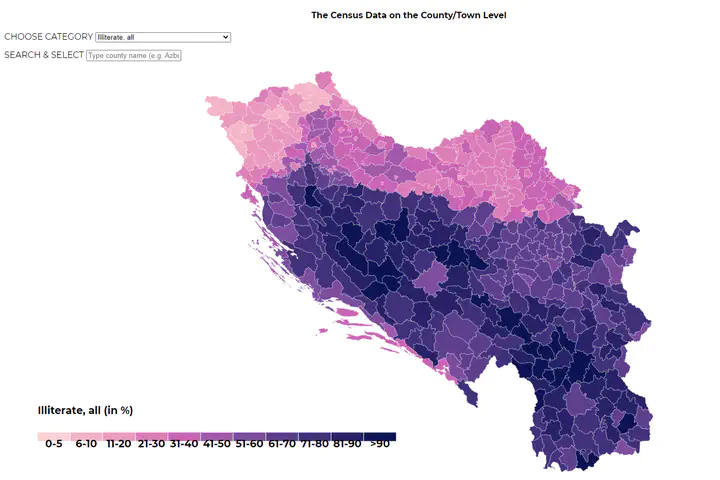
Another similar undertaking was my transformation of the pre-WWII German military map of Yugoslavia into a unique shapefile of a few hundred Yugoslav municipalities. I combined this shapefile with the 1931 census data, 80 years after it was first published (better late than never!). It took me almost a year to complete this tremendous project but I enjoyed every bit of it. I have teamed up with my brother who is a web developer and we even made an interactive map of Yugoslavia based on the 1931 census.[The screenshot of this interactive map is the top image in the post – the editor] We hope this project would serve not only scholars but also history enthusiasts to better understand a history of the country that is no more.
](/post/2021-03-03-ood_interview_maps/milos_popovic_internet_never_hu60318c7103cd3cda99083a1606023875_427407_e82ee907abc7d0af04a53386ae63340e.webp)
What do you think about collaboration based on open data and open-source software that processes such data?
It’s a fantastic opportunity for small teams to bypass traditional gatekeepers such as state institutions or big companies and use open source apps for the benefit of their local communities. For example, the access to Open Street Map allows small teams to map pressing communal issues as crime, deceases, or environmental degradation and come up with innovative solutions. In my work, too, I used OSM has helped me create several fine-grained maps that shed more light on local problems in Serbia such as pollution, car accidents or violence.
We are hoping to bring together environmental, sensory data and public attitude data on environmental issues? How can mapping help? What do you expect from this project?
More than ever, we are compelled to figure out how maladies spreads locally. Without mapping the hotspots, our understanding of the consequences of, for example, viral transmission or pollution is shrouded with a lot of uncertainty. We might have no clue how environmental issues shape public attitudes in localities until we use the mapping to turn on the light. Mapping would help this project pin down geographic clusters that require immediate attention from the private and public stakeholders.
Please [join us](https://reprex.nl/talk/reprex-Open data-day-2021/) for a digital coffee, tea or beer on International Open Data Day - we will put never seen data on maps, and discuss how to build successful open collaborations, with little, independent contributions to build large data observatories. Make sure you check out Milos’ amazing website, too!